Call or Text Us Now
Or, Have Us Contact You...
"*" indicates required fields
All of us are impacted by design on a daily basis whether we realize it or not. From online ads, to billboards, to tv & print ads, to standard emails – good and bad design is everywhere and whether you realize it or not, it’s affecting you positively or negatively. Even if you’re not a “creative person” or “don’t have a design eye” – you can subconsciously tell when a design is good or bad.
If an ad comes your way that looks terrible, you’ll likely disregard it in a matter of seconds as opposed to something that is designed well, that’s thought out and has a layout and design that pulls you in. You don’t even have to be a graphic designer or be in a creative industry to benefit from these elements. Good design can apply to emails, facebook posts, newsletters, taking pictures with your phone, etc.
Here are 5 elements of good design that you can not only look out for, but apply to your every day life:
It’s all about symmetry and balance. The objective of the rule of thirds is simple: it’s meant to help you achieve more balance and harmony when designing or taking pictures. The human eye is drawn to symmetry and harmonious design. If an image is too similar in both the left half and right half, or top and bottom, the audience may find it dull or boring. The rule of thirds keeps it interesting without the design looking too “off” or artsy. Imagine a grid on every image like the example below. Keeping objects and focal points at the 4 intersection points will achieve a much more balanced, symmetrical look as opposed to the second example where the subject is below the intersection point.
Try this out when you’re taking pictures on your phone next, you’ll see a remarkable difference with even your personal photos. You can apply the rule of thirds to photos, websites, newsletters and more! I recommend putting your “call-to-actions” on an intersection for greater impact. Check out a recent mailer I designed for The Barker Team realtors which uses the rule of thirds. The eye ends on the final intersection where the call-to-action is.

Notice the “Call The Barker Team” on the final intersection point.
Hierarchy is one of the most important elements of good design – it’s the literal act of making some elements bigger than others to show importance and a way of steering the human eye to show prominence. Here is a good example of BAD hierarchy. You don’t know what to click on, where to go or what to do on this webpage.

Bad Heirarchy
Good hierarchy is easy on the eye. It makes the user know what the most important information is and provides you with a VERY CLEAR direction of where to either go on a webpage or where your eye should go on a design. See one of our recent website designs using good hierarchy to tell users where to go on Capital City Staffing Solutions website.

Good Heirarchy
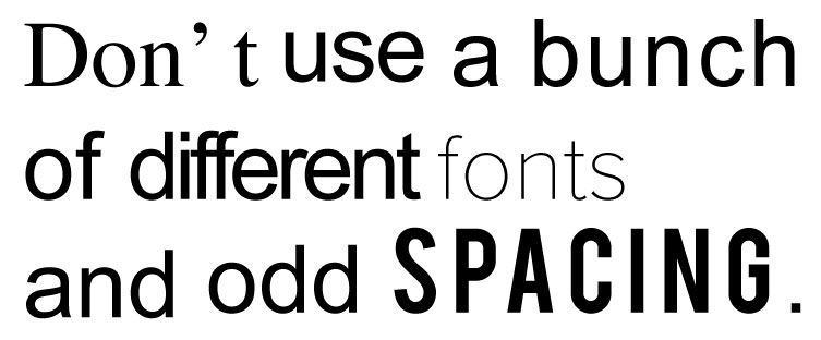
We all use typography on a daily basis – from emails, to Facebook messages, to letters and basic design for flyers, email newsletters, etc. Typography is really boiled down to getting your message across in the most concise, effective and most “eye-pleasing” way possible.

Here are some tips for good typography:
Sometimes the best designs are the most simplistic designs. This holds true for websites, flyers, emails, banners, logos, memos, etc. There’s nothing worse than bombarding your audience or recipient with too much information, excessive content or complex layouts. In this modern day of ADD, you need to get your message across within a few seconds no matter what medium you’re on.
Here’s an example of one of our more recent, simplistic designs displaying the rule of thirds, hierarchy and good typography.

Just remember KISS (keep it stupid simple) or depending on who you’re talking to…(keep it simple, stupid).
Don’t overlook the details. Whether it’s an email, a flyer design or an advanced graphic design piece, every little detail matters whether the recipients realize it or not. People may love a design but have no idea why, when it may just be a matter of a few of the elements mentioned above. Likewise, a person may not like a design because of a few too many fonts, or some alignment that doesn’t looks right to the eye. Good design matters and the care you put into everything will show.
We’re in the 21st century, we’re all visual. A good design using these principles may very well lead to a sale, or no sale of your product or service.
I hope these 5 elements of good design have inspired you to not only look out for good design on things that you see, but are also things that you can apply to your life whether you’re doing graphic design, photography or even if you’re just writing emails and documents. Again, people can tell good design whether they realize or not and you can use these principles to help you communicate more effectively in so many ways.
Cheers!